Summaries of Cinematography: Theory and Practice
- dara-2405
- Oct 6, 2025
- 28 min read
Summary by Dara Oliver
Chapter 1: Writing with Motion
Key Concepts: Cinematography, or “writing with motion,” uses framing, lens choice, lighting, color, movement, and texture to convey emotions, tone, and subtext visually. Every choice, from camera height to lighting, becomes part of a visual language that communicates internal states and narrative meaning beyond dialogue.
Building a Coherent Visual World: Cinematography establishes a believable universe that shapes audience understanding. Locations, props, wardrobe, and sound must cohere, unified by the DP and director through framing, lighting, color, and camera movement.
Key Strategies for World-Building:
Establishing shots orient geography and social hierarchy.
Framing and composition guide focus and create subtext.
Lens choices affect perspective and metaphorical meaning.
Lighting and color establish mood and theme.
Visual texture and camera movement enhance atmosphere and emotion.
Practical Techniques:
Framing: Wide (context, tone), Medium (relationships, mid-level story), Close-up (emotion, narrative focus).
Camera Movement: Crane (reveal spaces, power), Dolly (track journey, focus on characters), Handheld (urgency, subjectivity).
Visual Examples:
Blade Runner: Opening sequence conveys futuristic urban decay and social tension without dialogue via neon-lit city, crane moves, and detailed mise-en-scène.
Punch-Drunk Love: Wide shot and negative space express protagonist’s isolation; converging lines and overhead lighting reinforce psychological state.
Artistic Principles:
Composition as Narrative: Lines, shapes, and perspective guide viewer attention and mirror characters’ inner lives. Diagonals convey tension, converging lines entrap, triangles suggest hierarchy, linear perspective compresses or expands emotional space.
Collaboration of DP and Director:
Shared vision aligns mood, color, and metaphor.
DP fills gaps with creative solutions and visual references.
On set, DP balances artistic direction with practical execution.
Visual metaphors (framing, focus) translate abstract ideas into cinematic language.
Cinematography transforms visual choices into a storytelling language that complements performance, shaping narrative and emotion frame by frame.
Chapter 2: The Visual Language
Key Concepts: Cinematography organizes visual information so every element conveys meaning, emotion, or subtext. The frame acts as a dynamic canvas, guiding what viewers notice, how they process it, and the mood they feel.
Foundational Design Principles:
Unity: All elements, line, shape, light, color, work together for coherence.
Balance: Distribution of visual weight conveys order or tension.
Visual Tension: Slight imbalance keeps viewers engaged, hinting at change or conflict.
Rhythm: Repetition of shapes, colors, or patterns creates emotional pacing.
Proportion: Size relationships communicate dominance, vulnerability, or intimacy.
Contrast: Differences in light, color, or texture emphasize importance or subtlety.
Texture: Surface qualities (grain, filters, rain) reinforce tone and atmosphere.
Directionality: Lines and negative space guide the eye and highlight key elements.
Practical Techniques:
Rule of Thirds: Positions key subjects for balanced, dynamic composition.
Headroom & Noseroom: Ensures characters breathe and viewers anticipate action.
Open vs. Closed Frames: Open frames suggest world beyond, closed frames convey control or confinement.
Frame-Within-a-Frame: Inner frames (doors, mirrors, windows) focus attention and reinforce themes.
Visual Examples:
Citizen Kane: Deep focus maintains foreground, midground, and background, giving depth and narrative clarity.
Eternal Sunshine of the Spotless Mind: Repetition of visual motifs creates rhythm and tension, reflecting memory cycles.
Artistic Principles:
Chiaroscuro: Contrast of light and shadow sculpts space, emphasizes points of interest, and adds emotional weight.
Compositional Triangles: Organize elements to guide the eye and convey hierarchy or tension.
Sinuous (Reverse-S) Lines: Flowing curves direct gaze, soften rigidity, and mirror narrative or emotional arcs (e.g., The Black Stallion).
Cinematography uses these tools to structure visual storytelling, making each frame an active participant in narrative and emotion.
Chapter 3: Language of the Lens
Key Concepts: Lenses are not neutral, they each have an “optical personality” that shapes a scene’s emotional and spatial tone. Focal length, depth of field, and lens characteristics influence how viewers perceive space, relationships, and narrative importance.
Focal Length:
Wide (short) lenses: Expand space, exaggerate foreground, dynamic perspective, immersive environments.
Telephoto (long) lenses: Compress planes, flatten distances, suggest entrapment or isolation.
Optical Character: Lenses also impart contrast, sharpness, vignetting, and color “flavor,” subtly influencing mood.
Layering & Depth:
Foreground: Frames action, anchors attention.
Midground: Main action, interactions, narrative focus.
Background: Context, environment, thematic echoes.
Relative size should align visual prominence with narrative importance.
Focus Strategies:
Deep focus: Wide lens + small aperture; all planes sharp, encourages exploration.
Selective focus: Telephoto + wide aperture; isolates one plane, directs attention, enhances emotion or suspense.
Camera Height & Angle:
High angle: Diminishes subject, conveys vulnerability or power imbalance.
Low angle: Elevates subject, conveys dominance or threat.
Dutch tilt: Slanted frame for disorientation, tension, or moral ambiguity.
Practical Examples:
Seven (Final Scene): Telephoto compression forms spider-web pattern, reinforcing entrapment.
Delicatessen: Extreme wide-angle distorts foreground for humor and unease, exaggerating space while keeping composition central.
By choosing focal length, layering planes, depth of field, and camera angle, cinematographers control emotional resonance, spatial perception, and narrative subtext, often before a line of dialogue is spoken.
Chapter 4: Visual Storytelling
Key Concepts: Visual storytelling uses imagery, light, color, and composition to convey emotion, themes, and subtext without dialogue. Every frame can carry metaphor, mood, and narrative weight.
Visual Metaphor:
Objects as symbols: Bars, shafts of light, streetlamps suggest entrapment, moral conflict, or isolation (e.g., Blade Runner).
Composition as allegory: Circles, triangles, or frame-within-frame reflect power dynamics or psychological states.
Movement as metaphor: Camera pushes or crane moves can represent paralysis, history, or destiny.
Lighting and Color as Emotional Language:
Lighting:
Low-key: suspense, moral ambiguity.
High-key: openness, calm.
Motivated: practical sources justify dramatic light.
Color:
Hue conveys emotion (red = danger/passion, blue = melancholy, green = sickness/otherworldly).
Saturation/desaturation affects intensity or temporal distance.
Color contrast highlights characters or objects.
Practical Techniques:
Black-and-white vs. color: Signal time shifts, memory, or subjective reality (e.g., Memento).
Controlled flares and fog: Enhance atmosphere, subjective POV, or dreamlike states.
Subjective POV: Combine haze, color gels, and soft focus to reflect character perception.
Visual Examples:
Apocalypse Now: Green smoke and filtered sunlight create disorientation, foreboding, and psychological tension.
Caravaggio, The Calling of St. Matthew: Light acts as narrative force, emphasizing divine revelation.
Artistic Principles:
Every element, light, shadow, color, texture, composition, serves story and subtext.
Light shafts: Isolate characters, suggest hope, danger, or revelation.
Shadows: Convey threat, guilt, or secrecy.
Color palette: Warm tones = intimacy, cool tones = alienation; desaturation = detachment.
Composition & texture: Props, costumes, and atmospheric effects reflect character psychology.
Painting as Model:
Classical painters teach cinematographers single-frame storytelling:
Caravaggio: Dramatic chiaroscuro guides attention and emotion.
Rembrandt: Torchlit contrast communicates urgency and hierarchy.
Vermeer: Diffuse daylight emphasizes calm and focus.
Cinematographers sculpt meaning in every frame, using visual cues to enrich narrative and emotion beyond dialogue.
Chapter 5: Coverage & Continuity
Key Concepts: Cinematic storytelling uses framing, lens choice, camera movement, and editing to add meaning, emotion, and subtext. Coverage and continuity are tools to structure scenes, guide audience attention, and maintain immersion.
Coverage as Visual Writing:
Definition: The set of wide, medium, close-up, and cutaway shots that form a scene’s “grammar.”
Purpose: Gives editors flexibility to shape rhythm, tension, and emphasis in postproduction.
Film vs. Theater: Cinema selectively directs what the audience sees; the camera becomes a storytelling lens.
Subjectivity: POV shots and montage can immerse viewers in character experience.
Active vs. Passive Camera: A cinematic camera interprets the action, layering tone and narrative, not just recording.
Practical Coverage Methods:
Master Scene Method: Wide/master shot followed by closer setups.
Overlapping (Triple-Take) Method: Film same action multiple times from different angles.
In-One/Oner/Plan-Sequence: Long, uninterrupted take choreographed for camera, actors, and lighting.
Freeform Method: Handheld/documentary style for spontaneity and realism.
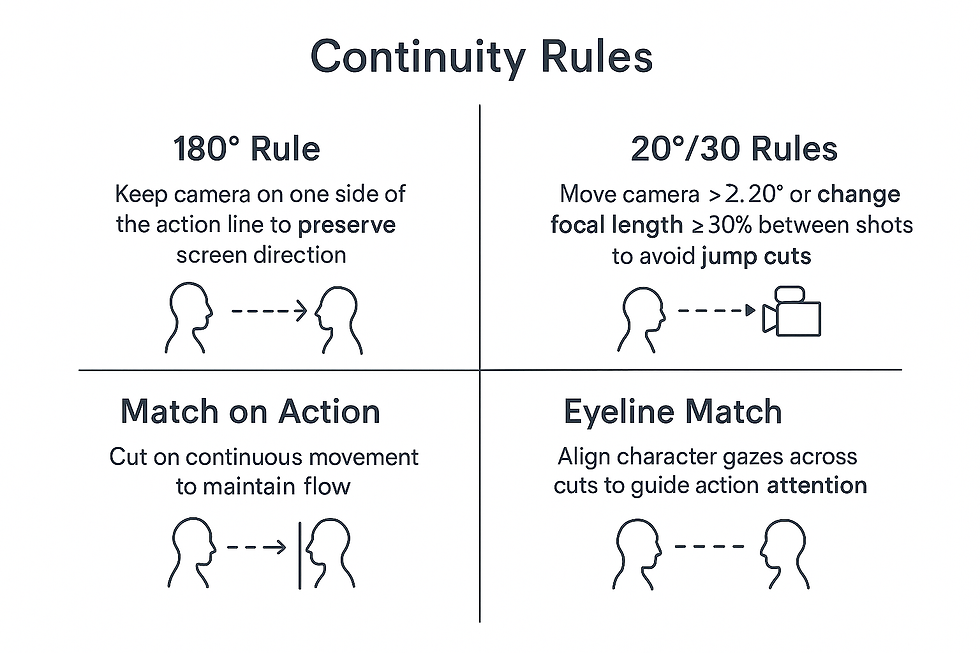
*Continuity Rules:
Axis (180°) Rule: Keep camera on one side of the action line to preserve screen direction.
20°/30° Rules: Move camera ≥20° or change focal length ≥30% between shots to avoid jump cuts.
Action Matching: Cut on continuous movement to maintain flow.
Eyeline Consistency: Align character gazes across cuts to guide attention.
*More Explained:
1. The Axis Rule (180°)
What it is: Imagine an invisible line running through the characters or the main movement of the scene – this is the “line of action” or the “180° line”.
How it works: The camera must always remain on one side of this line throughout the scene. This ensures that the direction of the characters and objects on screen remains consistent.
Why it matters: It prevents the audience from becoming confused about where the characters are in relation to each other.
Example: Two characters talking face to face: if Character A is on the left and Character B is on the right, by keeping the camera on the same side, A will always appear on the left of the screen. If the camera crosses the line, A and B will swap positions on screen, confusing the viewer.
2. The 20°/30° Rules
What it is: These are rules designed to avoid abrupt cuts that cause visual discomfort, known as jump cuts.
How it works:
The 20° Rule: The camera must move at least 20° in relation to the subject between two consecutive shots. Less than this can make the cut look like it “jumped” without purpose.
The 30% Rule: If you do not change the angle, you should change the focal length (zoom) by at least 30% between shots.
Why it matters: It preserves visual continuity and helps transitions between cuts feel natural.
Example: If you are filming a close-up of a character and want to cut to another close-up, moving the camera 20° or adjusting the zoom helps avoid the cut looking “strange” or jarring.
3. Match on Action
What it is: Cutting during a continuous movement in order to maintain the flow of the scene.
How it works: The action begun in one shot continues in the following shot, even if the angle or camera distance changes.
Why it matters: It makes the editing appear smooth and natural, keeping the audience immersed.
Example: A character begins to open a door in a medium shot; the cut to a close-up shows the hand completing the movement on the handle. The action feels continuous, even though the framing has changed.
4. Eyeline Match
What it is: Aligning the direction of a character’s gaze across cuts.
How it works: If a character looks at something or someone, the following shot should show the object or character being looked at, in the correct direction.
Why it matters: It helps the audience understand what the characters are seeing and preserves the spatial logic of the scene.
Example: Character A looks to the right; the next shot shows what he is looking at on the left side of the screen, maintaining positional correspondence and visual logic.
Visual Examples:
The Shining: Aerial master shot compresses geography, creates dread, foreshadows isolation.
Barry Lyndon: Static, balanced frames and chiaroscuro illustrate social hierarchy and power structures.
Artistic Principles:
Framing & Editing Shape Emotion: Shot size and composition control intimacy, tension, and empathy.
Shot Scale Progression: Wide establishing shots → medium/close shots heighten engagement.
Editing Tempo: Slow cuts allow reflection; rapid cuts increase tension.
Compositional Motifs: Repeated patterns, negative space, and off-center framing communicate themes.
Visual Rhythm: Match-on-action cuts maintain flow; reaction shots shift focus and empathy.
Invisible Editing Techniques:
Whip pans / swish cuts: Blur hides transitions.
Cutting on movement: Seamless transition through action.
Natural masks: Passersby, fog, or lens flares conceal edits.
Match cuts / graphic matches: Align shapes, colors, or lines across shots for subconscious continuity.
Audio bridges: Carry sound across cuts to prime viewer perception.
Summary: By combining thoughtful coverage with rigorous continuity, filmmakers create seamless, emotionally resonant scenes where every camera choice conveys story, subtext, and rhythm while keeping the audience immersed.
Chapter 6: Color
Key Concepts: Color in cinematography serves both technical and narrative purposes—conveying mood, symbolism, and story cohesion while ensuring visual consistency.
Color Temperature and Balance:
Temperature: Measured in Kelvins; ~2,700 K = warm amber, 5,600 K+ = cool blue.
White balance: Keeps neutral grays accurate under any light.
Black balance: Ensures shadows are true black without color cast.
Magenta/Green shifts: Correct LED and fluorescent quirks.
Purpose: Consistent color fidelity across shots and mixed-light environments.
*Gamut and Color Spaces:
Rec.709: HDTV standard, covers ~1/3 of visible spectrum, SDR workflows.
DCI-P3: Digital cinema, wider hue volume, richer greens and reds.
ACES: Wide gamut scene-referred workflow; preserves full dynamic range from camera through post.
Goal: Align on-set exposure, gels, and postgrades for faithful final projection.
*More Explained:
Gamut and Colour Spaces
When we talk about colour gamut and colour spaces, we are dealing with the limits of which colours and intensities a system (camera, monitor, projector, software) is able to capture, process, and display.
Rec.709
It is the standard for HD TV (1080p).
It covers about one third of all the colours the human eye can perceive.
Used in SDR (Standard Dynamic Range) content, meaning limited contrast and brightness range.
Example: Most television channels and older YouTube videos are in Rec.709.
DCI-P3
Created for digital cinema.
Can display more colours than Rec.709, particularly in greens and reds, giving greater “vividness” and depth.
It is the standard used in modern digital cinema theatres.
Example: When you watch a blockbuster in the cinema, the colours that seem richer and more intense come from DCI-P3.
ACES (Academy Color Encoding System)
It is a professional colour workflow, created by the Academy of Motion Picture Arts and Sciences (the same organisation behind the Oscars).
It has a much wider gamut than Rec.709 and DCI-P3, practically encompassing all the colours that modern digital cameras are capable of capturing.
Scene-referred: This means it preserves everything the camera captured, without “squeezing” or limiting the colours too early in the process.
Advantage: It maintains the full dynamic range (the difference between the brightest and darkest parts) from capture through to post-production.
Afterwards, you can “convert” this material to Rec.709 (TV), DCI-P3 (cinema), or HDR (streaming).
The practical goal of this:
On set, the cinematographer uses gels (physical filters) and measures exposure already considering the colour space in which the film will be finalised.
In post-production, the colourist uses colour grading within the chosen space (Rec.709, P3, or ACES).
This way, when the work is shown (on TV, in the cinema, or via streaming), the visual result will be faithful to what was planned.
In summary:
Rec.709 is like a box of 12 coloured pencils.
DCI-P3 is a box of 24 pencils with more vivid tones.
ACES is like saving the drawing as a digital file with 1 million colours, only at the end deciding whether to print it with 12, 24, or all of them.
Rec.709 → TV / limitedDCI-P3 → Cinema / more coloursACES → Master file / preserves everything
Color as Storytelling:
Mood: Warm ambers = nostalgia/comfort; cool blues/greens = isolation, dread.
Symbolism: Red = passion/violence/danger; green = growth/decay/envy.
Narrative coherence: Limited palettes unify locations or timelines; tonal shifts mirror character arcs.
Practical Techniques:
Gels & Filters:
CTO warms daylight to tungsten; CTB cools tungsten to daylight.
Magenta/green filters neutralize color casts.
Creative filters (diffusion, soft-focus, star) shape texture, emotion, or time-of-day.
*Digital Grading:
ASC-CDL: Metadata controls slope, offset, power, saturation; preserves look across post.
LUTs: 1D for gamma/contrast, 3D for full RGB mapping; ensures on-set appearance matches final output.
*More Explained:
Digital Grading
Colour grading is the process of adjusting and stylising the image’s colour in post-production. It is like the “final retouch” of the cinematography and the atmosphere of the scene. Here, two widely used tools come into play: ASC-CDL and LUTs.
ASC-CDL (American Society of Cinematographers – Color Decision List)
It is a metadata standard created by the ASC to maintain colour consistency throughout production.
It does not alter the image itself, but stores simple mathematical instructions so that editing and grading software know how to apply basic adjustments.
It controls four main parameters:
Slope: adjusts colour/brightness gain (similar to changing the exposure).
Offset: shifts all colour values up or down (like overall brightness).
Power: adjusts tonal contrast (similar to manipulating the gamma curve).
Saturation: increases or reduces the intensity of colours.
The ASC-CDL is used so that what you see on set (on the monitor with a LUT applied) is reproduced later in the editing suite and in the final grading.
Visual Examples:
O Brother, Where Art Thou? – Sepia-toned DI creates a warm, period-authentic look across interiors/exteriors; preserves skin tones and narrative cohesion.
Aphex Twin “Come to Daddy” – Extreme green/cyan casts, high contrast, and rapid color shifts enhance surreal, nightmarish mood.
Artistic Principles:
Warm vs. Cool Palettes: Cue time of day and emotional states; gels and white balance reinforce subtext.
Desaturation & Highlight Contrast:
Desaturation = detachment, moral ambiguity, or historical authenticity.
Adjusting highlight/shadow contrast draws attention to key story elements, guiding emotional focus without dialogue.
Summary: By manipulating temperature, balance, gamut, filters, and grading, cinematographers use color as a storytelling tool, communicating mood, thematic nuance, and narrative cohesion while maintaining visual consistency.
Chapter 7: Cameras & Sensors
Key Concepts: Digital cinematography starts with light hitting the sensor and ends with an image on screen. Understanding the sensor, signal path, and capture format is essential for both technical fidelity and storytelling.
*Digital Signal Path:
Photon-to-Electron Conversion: Photosites convert light to analog voltage.
Analog-to-Digital Conversion (ADC): Converts voltage into digital values; preserves exposure/color latitude.
Raw File Encoding: Packages sensor data and metadata (exposure, white balance, timecode).
On-Set Monitoring: LUTs/proxies allow focus and framing checks without committing to a look.
Postproduction: Demosaicing, color grading, transcoding to ACES, Rec.709, DCI-P3 for deliverables.
*More Explained:
Analogy: “From light to screen = a letter to its destination”
1. Photon–electron conversion (photosites → analogue voltage)
Imagine you take a photograph with an analogue camera.
Light (photons) hits the film/sensor (photosites) and generates a latent image (still invisible).
Here we only have a physical/analogue impression — like handwriting in a letter.
2. Analogue–Digital Conversion (ADC)
Now, someone types that letter into a computer.
What was analogue (voltage) becomes digital text (numbers).
This ensures that the information can be read consistently on any machine.
At this stage, the camera takes that voltage and converts it into digital values of colour and intensity.
3. RAW file encoding
Next, you save the document and attach extra information:
Author’s name (exposure metadata).
Date/time (timecode).
Language (white balance).
The file is still raw, without final formatting — like a draft PDF with everything recorded.
4. On-set monitoring (LUTs/proxies)
Meanwhile, you print a temporary copy of the letter to review before sending it.
This copy is not definitive, but it helps you check that the content is legible.
This is the same as applying a LUT to view the image with “ready” colour and contrast, without affecting the RAW file.
5. Post-production (demosaicing, grading, transcoding)
Finally, you format the letter for the right recipient:
Translate it into the required language (Rec.709 for TV, DCI-P3 for cinema, ACES for professional workflow).
Revise style and formatting (colour grading).
Convert it into compatible versions (PDF, DOC, e-mail).
Thus, the same original message (RAW) can be delivered in multiple formats, each adapted to the final audience.
In summary:
Photosites → analogue = handwriting the letter.
ADC → digital = typing the letter on a computer.
RAW → raw file = draft saved with metadata.
LUT/proxy → review copy = test print version.
Post-production → final delivery = formatted letter sent in the right language.
Sensor Types:
CCD: Uniform color, low noise, slower, more power.
CMOS: Faster, lower power, on-chip ADC; may show fixed-pattern noise.
Photosites vs. Pixels:
Photosites: Raw light detectors on the sensor.
Pixels: Reconstructed image samples after ADC and demosaicing.
Bayer Filter & Demosaicing:
Bayer Array: RGB mosaic (2× green for luminance).
Demosaicing: Interpolates full-color info for each pixel.
Chroma Subsampling:
Reduces color data to lower bandwidth (e.g., 4:2:2, 4:2:0) while preserving perceived image quality.
Sensor Size & Depth-of-Field (DOF):
Larger sensors → shallower DOF, better low-light performance, improved dynamic range.
Smaller sensors → deeper DOF, higher nominal resolution, but more noise in shadows.
Crop Factor & Aperture: Effective f-stop = physical f-stop × crop factor.
Format | Crop | DOF | Resolution | Low-Light |
Full Frame | 1× | Shallow | High | Excellent |
Super 35/APS-C | ~1.5× | Moderate | Moderate-High | Very Good |
Micro 4/3 | 2× | Deep | High | Good |
1″+ | 2.7×+ | Very Deep | Highest | Fair |
RAW vs. Baked Codec:
RAW: Linear sensor data, maximum dynamic range, full color fidelity, flexible white balance; larger files, slower workflow.
Baked Codec: In-camera gamma, subsampling, compression; ready for NLE but less post flexibility
Artifacts from Compression/Rec.709:
Banding, macroblocking, mosquito noise, chroma smearing, highlight clipping.
RAW avoids these via higher bit depth, full chroma, no in-camera compression, deferred gamma.
Artistic Principles:
Low-Light Grain: Adds texture, nostalgia, moral ambiguity, subjective immersion.
Clinical Clarity: Sharp, low-noise images for objective, analytical, or futuristic storytelling.
Balance: Use grain and clarity selectively; dual-gain sensors can combine clean highlights with shadow texture.
Practical Takeaways:
Monitor RAW with LUTs for real-time reference.
High-bit-depth codecs with low chroma subsampling reduce artifacts if RAW isn’t practical.
Match sensor choice, ISO, and compression to narrative intent: grain for emotion, clarity for objectivity.
Chapter 8: Measurement
Key Concepts: Accurate exposure and color control rely on objective measurement tools, complementing visual judgment.
Primary Tools:
Waveform Monitors:
Line-by-line luminance graph (brightness vs. horizontal position).
Detect clipped highlights or crushed shadows.
Show IRE values for exposure precision.
*It is like a topographic map of light: it shows where it is high (very bright) and where it is low (very dark). It helps to see if any part of the image has become “blown out” or “crushed”.
Vectorscopes:
Hue = angle; saturation = distance from center.
Align skin tones, secondary colors; check Rec.709 gamut compliance.
*It is like a compass of colours: the angle shows the direction (which colour) and the distance shows the strength (saturation). It is used to keep skin tones on the right track and to avoid colours going out of range.
Histograms:
Show pixel brightness distribution from black (left) to white (right).
Diagnose over- or underexposure; can analyze individual RGB channels.
*It is like a balance of light: it shows how much weight (pixels) is on each side, from black to white. If the weight is only on the left → too dark, only on the right → too bright.
Standards & Safe Levels:
PLUGE: Super-black, reference black, low-level white; calibrates monitor black levels.
It's like adjusting the contrast on your old TV: you define where the real black is and where detail starts to appear.
Full vs. Studio Swing:
Full: 0–255 digital codes
Studio (legal): black = 16, white = 235
It's like a piano: the full track uses all the keys (0-255), the studio track only plays from C sharp to middle C sharp (16-235).
Gamma Control:
Midtone curve shaping; Rec.709 ~2.4 gamma;
log curves (S-Log, C-Log) require LUTs.
It's like adjusting the brightness of a light bulb with a dimmer: you mould the mid-tones without completely changing light or dark.
Practical Techniques:
Monitor Calibration: Use PLUGE, grey cards, and colour bars to align black, white, mid-tones, and colour.
It is like tuning a guitar: you use references (grey card, colour bars) so that everything comes out in the right pitch (black, white, mid, and colour).
Zebras: Overlay of stripes indicating exposure; 100% for highlights, 70% for skin tones.
It is like having a magnifying glass with a mark on a ruler: it shows where the light has already gone beyond the limit (100%) or where it is at the skin level (70%).
False Colour: Colour-coded IRE map for point-by-point exposure feedback.
It is like a weather heat map on TV: each colour shows a level of exposure, point by point.
Visual Monitoring Examples:
Rec.709 Limit: The vectorscope triangle shows the legal gamut.
It is like colouring inside a colouring book: the triangle is the limit; if you stay inside it, you are “within the rules”.
Oversaturated Neons/LEDs: Peaks outside the triangle indicate colours beyond the gamut.
It is like using a fluorescent highlighter that the printer cannot reproduce: it goes outside the triangle.
Skin Tone Shift: Magenta/green changes under mixed lighting signal the need for rebalancing.
It is like taking one photo in a room with a yellow lamp and another near a window with blue light: the skin changes tone (and needs correction).
“Pincushion” Shapes: Multi-lobed patterns on the vectorscope from mixed sources indicate inconsistent hues.
It is like mixing several out-of-tune singers: each voice pulls in a different direction, creating an irregular shape.
Artistic Principles:
(Imagine you are preparing a party with lights, colours, and music, and each measuring tool is an “instrument” to ensure everything looks beautiful and consistent.)
Measurement as a Creative Tool:
Light meters, waveforms, histograms, and vectorscopes guide intentional contrasts, placement of shadows/highlights, and colour palettes.
The waveform is the topographic map of light, showing where the room is too bright or too dark.
The histogram is the balance of light, telling you if the corners are balanced or need adjustment.
The vectorscope is the compass of colours, ensuring the party lights do not stray from the desired tone.
With these tools, you can place shadows and highlights and choose the party’s colour palette intentionally.
Mood & Narrative:
Controlling the key-to-fill light ratio defines the emotional tone: dramatic noir (high contrast) vs. romantic high-key (soft contrast).
Controlling the key light and the fill light is like choosing the party’s atmosphere:
Dramatic noir: strong light and intense shadow → mysterious party, high contrast.
Romantic high-key: soft, even light → cheerful, gentle, and delicate party.
Colour Modelling:
Waveform and vectorscope help ensure skin tones and creative gradations survive the constraints of display/distribution.
The waveform and vectorscope work like a heat map of lights and colours: they ensure skin tones and creative colours survive even if the room has mixed lights or fluorescent LEDs.
They prevent anyone from appearing magenta or green, maintaining a natural look.
Unity, Rhythm, Contrast:
Consistent measurements maintain scene coherence, rhythm in hue/lighting changes, and visual tension through contrast.
Consistent measurements are like a well-rehearsed song: each change in light and colour has rhythm, creating coherence at the party.
Colours and contrasts work like notes, keeping attention and visual tension in a pleasant way.
Using measuring tools is like organising a perfect party:
You monitor light and colour (waveform, vectorscope, histogram).
You choose the atmosphere (contrast and lighting).
You ensure everyone looks good (skin tones and colours).
And you maintain rhythm and unity so that the final experience is harmonious and impactful.
Conclusion:
Accurate measurement transforms exposure and colour into a creative language, enabling confident visual storytelling that is reproducible across different lighting schemes and display formats.
Chapter 9: Exposure
Exposure = Balance of Light
Key Concepts:
Exposure balances light, aperture (f-stop), shutter angle/frame rate, and sensor/film response curves to control brightness, motion blur, and contrast.
Think of exposure as preparing a room for a party: you want everything to be visible, but not too bright or too dark, while still keeping the right atmosphere.
Light:
Intensity, direction, and quality (hard/soft) determine detail, contrast, and texture.
= the quantity and type of lamps in the room.
In low light: open the aperture, reduce shutter speed, or increase ISO.
Low light → open the windows (open the aperture), leave the lamps on for longer (reduce shutter speed), or use stronger lamps (increase ISO).
Aperture (f-stop):
Low f (f/1.4–f/2.8) → more light, shallower depth of field.= large windows: more light enters, background blurred (shallow depth).
High f (f/11–f/16) → less light, deeper depth of field.= small windows: less light enters, everything in focus (greater depth).
Shutter Angle / Shutter Speed:
The time the camera “looks” at the light.
Video: fraction of the frame period during which the shutter is open; 180° at 24 fps ≈ 1/48 s.= natural blur.
Photography: duration in seconds (1/200 s, 1 s).
Long exposure → more light, more motion blur.Long exposure = looking for longer → more light, motion blur.
Short exposure → less blur.Short exposure = looking quickly → less light, minimal blur.
Response Curves (H&D characteristic):
Toe: shadows; flattened response.= shadows → “dark corners of the room”.
Linear: proportional; doubling exposure = doubling output.= everything proportional → double the light = double the brightness.
Shoulder/Knee: highlights; compression or clipping occurs.= highlights → very strong light begins to “burn out” details.
Dynamic Range:
Range of recordable tones without loss of detail; measured in stops.
= the camera’s ability to see details from dark to bright without losing anything.
Film negatives: ~12 stops (smooth highlight transition).→ smooth transition.
Digital sensors: ~12–16 stops (abrupt knee, harsh clipping).→ highlights can blow out quickly.
Expose-To-The-Right (ETTR):
Histogram peak shifted to the right without clipping.
= imagine pushing all the party lights a bit towards the brighter side, without “blowing out” the ceiling.
Captures more photons → less noise in shadows, preserves detail.More light = cleaner shadows, preserved details.
Risk: highlights can blow out; requires careful adjustment in post.Very strong lights may burn out (clipping), so care is needed in post-production.
Trade-Offs:
Scenario | Adjustment | Consequence |
Under-exposed shadows | Increase ISO / brighten in post | Noise, grain, lost detail |
ETTR-guided mid exposure | Open aperture / slower shutter | Low noise, safe highlight margin |
Over-exposed highlights | Reduce light / stop down | Clipped, unrecoverable data |
Practical Techniques:
Incident vs. Reflectance Metering:
Incident: Measures light falling on subject; unaffected by color/reflectivity; accurate lux/foot-candle reading.
Reflectance: Measures light bouncing to camera; affected by subject tone; use spot-meter for key highlights/midtones.
Waveform-Guided Exposure:
Graphs luminance across the frame (0% shadows → 100% highlights).
Adjust aperture/ISO/shutter to keep highlights below top rail; shadows above zero.
Zebras:
Overlay indicating brightness thresholds.
~70% for skin tones, 90–100% for specular highlights.
Use for fast ETTR/exposure feedback.
Shutter Angle for Motion Blur:
180° → natural blur (standard).
Wider angles → more blur (dreamy, speed).
Narrow angles → crisp blur (action/stylized).
Adjust ISO/aperture if exposure requires changes.
Visual Guidance:
Zebras highlight overexposed skies or underexposed shadows.
Toggle between high-end (100%) and low-end (40–60%) thresholds to monitor full tonal range.
Artistic Principles:
Overexposure / Dreamlike Softness:
Lifts shadows, washes midtones → ethereal glow.
Practical: meter normally, open 1–2 stops, soften with diffusion.
Applications: wedding portraits, fashion editorials, nostalgic scenes.
Underexposure / Stark Realism:
Deep shadows, high contrast → moody, gritty, documentary feel.
Practical: meter normally, close aperture 1–2 stops, watch zebras/waveform.
Applications: noir portraits, urban documentaries.
Balancing Trade-Offs:
Exposure | Benefit | Trade-off |
Overexposure | Minimal shadow noise, glow | Clipped highlights, lost texture |
Underexposure | Dramatic contrast, focus | Noisy shadows, lost black detail |
Takeaway: Exposure is both technical and creative. Use meters, waveform, zebras, and shutter control to shape mood, contrast, and realism while keeping technical fidelity within safe bounds.
Chapter 10: Image Control & Grading
Key Concepts:
DIT Workflow (Lift, Gamma, Gain):
Lift (Shadows): Adjusts darkest tones without shifting midtones. Deepens blacks or recovers shadow detail.
Gamma (Midtones): Controls the bulk of tonal values; affects mood, skin tones, and general contrast.
Gain (Highlights): Governs peak brightness; sculpts specular highlights or reins in blown whites.
Curves:
RGB Curve: Fine-tune contrast, highlight roll-off, or color casts.
Masked/Windowed Curves: Target specific areas or hues (sky, foliage).
Log Grading:
Preserves maximum dynamic range by flattening contrast in-camera.
Adjust Lift/Gamma/Gain in log space before display conversion.
Use Log Offset/Master to shift overall brightness uniformly.
LUTs (Lookup Tables):
Technical LUTs: Convert log footage to Rec.709 for viewing/standards.
Creative LUTs: Apply stylized looks (film stocks, palettes). Use after primary grade.
Front-of-Lens vs. Post-Grading:
Filters (on-set): Diffusion, color gels, graduated ND, polarizers shape mood and texture in-camera.
Post Grading: Pixel-level precision, dynamic range manipulation, scene-by-scene adjustments.
Balance: Filters lock in practical texture; post grading refines global look and creative adjustments.
Bi-Packing Raw + Color-Negative:
Capture clean digital raw + analog color-negative simultaneously.
On-set: Use mirror-box or beam-splitter rig, sync timecode, expose each medium optimally.
Post: Scan negative, log-encode, apply film-stock IDT. Composite over digital raw with soft-light/overlay (10–30%).
Adjust curves, gain, and masks for selective glow, halation, and color cast.
Result: Combines digital fidelity with filmic texture, glow, and subtle color nuances.
Look Creation in ACES or Rec.709:
ACES: Ingest, primary grade (Lift/Gamma/Gain), curves & color wheels, output transform, export LUT.
Rec.709: Ingest via technical LUT, balance lift/gamma/gain, creative contrast adjustments, export monitor-friendly LUT.
Best Practice: Keep technical and creative LUTs separate, test on multiple monitors, embed metadata.
Artistic Principles:
Contrast and color convey moral and emotional cues:
Lift/gain: light = hope, dark = corruption.
Warm tones → safety, sincerity; cool/desaturated → isolation or deceit.
Graded contrast guides viewer attention and emotional focus.
Chapter 11: Camera Filters & Effects
Diffusion Filters:
Soften sharpness, bloom highlights, reduce perceived detail.
Examples: Black Pro-Mist, Glimmerglass, Silk, Fog.
Evoke dreamlike or nostalgic qualities.
Neutral Density (ND) Filters:
Reduce exposure without color bias.
Types: solid, variable, graduated.
Practical: control motion blur, shallow depth of field in bright light.
Contrast & Color Filters:
Shape midtone transitions and separation.
BW filters (yellow, red) enhance sky, foliage, skin contrast.
Warming (80A, 85B) and cooling (82A, 82B) filters adjust color temperature.
Polarizers:
Control reflections and glare; boost saturation.
Linear for film cameras, circular for modern DSLRs/EVFs.
Infrared (IR) Filters:
IR-cut: block infrared to avoid color shifts and artifacts.
IR-pass: capture infrared imagery for creative or surveillance use.
Practical Techniques:
Pearl Diffusion on Practicals: Softens bulbs, maintains motivated lighting while flattering actors.
Graduated ND: Balance bright skies vs. dark foregrounds.
Lens Coatings / De-Coating: Older lenses or stripped coatings create naturalistic halation, softer shadows, muted saturation (e.g., Saving Private Ryan).
Artistic Principles:
Filters extend visual metaphor:
Diffusion → memory, romance, dream.
ND → depth-of-field storytelling.
Warming/Cooling → moral/emotional temperature.
Polarizers → clarity, “truth.”
Layered filtration creates texture, tension, and narrative unity.
Combining in-camera filters with post grading maximizes creative and technical control.
Chapter 12 – Lighting Basics
Attributes of Light
Hard vs. Soft: Hard light = small/distant source, sharp shadows, high contrast; Soft light = large/diffused source, gentle shadows, flattering.
Intensity: Measured in stops/foot-candles; high-intensity key = deep chiaroscuro, low-intensity fill = high-key look.
Color Rendering Index (CRI): High CRI (90–100) = natural colors; low CRI = color casts, mismatched gels.
Shape: Light fixture form controls spill and shadow shape; influences architectural emphasis and subject modeling.
Separation: Backlight/kicker/hair light isolates subject from background, adds visual depth.
Depth: Contrast and overlap of foreground/midground/background create three-dimensional storytelling.
Texture: Hard light reveals surface detail; soft light smooths skin; layering adds tactile richness.
Motivated vs. Unmotivated Light: Motivated = from visible sources (windows, lamps); Unmotivated = purely aesthetic; balance gives realism + expressive impact.
Practical Techniques
Three-Point Lighting: Key (dominant), Fill (soften shadows), Backlight (rim/hair separation).
Practical Accents: On-screen lamps/candles for motivated lighting; gels/diffusion control intensity.
Silks & Diffusion: Large silks or butterfly rigs soften fill, control contrast; cookies/gobos project patterned shadows for texture.
Visual Examples
Caravaggio/Tenebrism: Single high-contrast source, deep shadows, dramatic focus → inspiration for film noir.
Noir Films: The Maltese Falcon, Double Indemnity, He Walked by Night → use of blinds, shadow patterns, and chiaroscuro.
Artistic Principles
Knowledge vs. Ignorance: Light = revelation/truth; shadows = mystery/deceit.
Purity vs. Corruption: High-key/soft = innocence; Low-key/harsh = moral decay or tension.
Chapter 13 – Advanced Lighting Tools
Light Sources
HMI: Daylight-balanced, high-intensity, great for sunlight simulation; ballast required.
LED: Color-temp flexible, low power, remote-phosphor/RGB options, CRI > 90.
Tungsten: Warm 3200 K, dimmable, predictable; high heat, heavy.
Xenon: Daylight-like, high output, studio/specialty use.
Fluorescent Tubes: Soft, wraparound, high CRI, easy to gel; some flicker.
Balloon Lights: 360° soft fill, good for interiors/exteriors; wind stability required.
Chinese Lanterns: Soft ambient light, lightweight, practical for overhead or confined spaces.
Grip Equipment
Flags: Block/shape light, negative fill.
Silks: Diffuse hard light, reduce contrast.
Nets: Reduce intensity without hard shadows.
Reflectors: Bounce light, adjust warmth/coolness.
Practical Techniques
Daylight + Tungsten: Meter window, gel tungsten to match, feather key with diffusion, flag unwanted spill.
Balloon Lights: High placement for wide, even fill; adjust intensity with ballast/ND nets; gel for moonlight or balanced color.
Visual Examples
Under-Light (“Halloween Light”): Key from below = threatening, unnatural shadows. Kubrick’s Dr. Strangelove War Room: low Fresnel under table for menace, exaggerated facial planes.
Artistic Principles
Balancing Narrative Tone: Soft, low-contrast fill → safety/emotional honesty; Hard, focused light → tension, threat, moral ambiguity.
Seamless Fill Tools: Silks, balloon lights, reflectors, fluorescent/LED for openness and clarity.
Stark Silhouette Tools: Hard Fresnels, ERS, minimal/no fill, strong backlight → dramatic, high-contrast storytelling.
Practical Decision-Making: Match lighting style to narrative emotion; combine soft + hard, color shifts, haze for thematic depth.
Chapter 14 – Optics & Focus
Key Concepts
Circle of Confusion: Max blur perceived as a point; smaller circles → deeper focus, larger → shallower.
Depth of Field (DOF): Zone appearing acceptably sharp; determined by aperture, focal length, subject distance, and circle of confusion.
Hyperfocal Distance: Nearest focus point where everything from half that distance to infinity is sharp; maximizes DOF for wide shots.
Nodal Points: Lens pivot points that prevent parallax; useful for complex matting or precise camera rotations.
Specialty Optics
Macro Lenses: High magnification, flat-field design, 1:1 reproduction; ideal for fine textures.
Diopters: Screw-on close-up filters; quick but can add distortion at high strengths.
Extension Tubes & Bellows: Physically extend lens-sensor distance; bellows = variable control over magnification and DOF.
Snorkel Lenses: Periscope-style macro lenses for tight spaces; maintain perspective and working distance.
Practical Techniques
Rack Focus / Pull Focus: Shift focus between subjects to direct attention or signal narrative/emotional beats.
Revealing Info: Blur → sharp to show discovery.
Emotional Reorientation: Shift focus to invert power dynamics or highlight reaction.
Depth-of-Field Calculators: Tables or apps (e.g., pCAM Pro, DoF Calc) predict focus range for close-ups.
Variables: focal length, aperture, subject distance, circle of confusion.
Stop down only as necessary; pre-mark focus points for precision.
Visual Examples
Black Swan: 100 mm macro at f/4; focus on sweat bead = psychological fragmentation.
Sicario: 60 mm macro with extension tube; rust fleck = moral decay.
The Revenant: Diopter + 105 mm macro; dew drops = isolation.
Days of Heaven: Bellows 2:1 magnification; sunflower petal veins = fragile innocence.
Technique Highlights
Macro lenses → edge-to-edge sharpness.
Diopters → quick close-focus, minor aberrations.
Extension tubes/bellows → precise DOF control without changing optics.
Artistic Principles
Revealing Information: Focus shifts act as visual reveals, replacing cuts or exposition.
Character Subjectivity: Focus tied to gaze or emotion guides audience empathy; abrupt shifts = surprise/shock, slow pulls = realization or memory.
Practical Applications:
Shift focus to objects, characters, or textures to suggest tension, decay, or narrative subtext.
Combine with dollies or lighting changes to enhance emotional or thematic impact.
Chapter 15 – Camera Movement
Key Concepts
Motivation vs. Invisible Technique: Every camera move should serve story or emotion; “invisible” moves go unnoticed but underline narrative.
Common Moves:
Pan: Horizontal rotation; reveals off-screen info, follows lateral motion.
Tilt: Vertical rotation; shifts attention low↔high.
Track/Dolly: Smooth motion along rails; intimacy (in) or suspense (out).
Crane: 3D vertical/horizontal sweeps; geography, emotional elevation/descent.
Handheld: Raw, immersive, tense, subjective POV.
Steadicam: Stabilized fluid motion without rails; long takes.
Drone: Aerial, dynamic geography, dramatic reveals.
Cable-Cam: Suspended motion over obstacles; action and vistas.
Practical Techniques
Countermoves & Reveal Moves: Balance or offset primary motion; reveal info smoothly.
Movement + Focus Pulls: Combine spatial and optical shifts for narrative emphasis. Example: track to background, then rack focus to reveal detail.
Choreography: Push/pull focus interplay encodes character perception and plot priority.
Visual Examples
Statue of Liberty + Ferry: Aerial spiral → backward tracking → dissolve → seamless narrative and metaphor (liberty vs. routine).
Artistic Principles
Chaos vs. Control: Shaky or erratic motion = turmoil; smooth dolly/Steadicam = mastery.
Freedom vs. Confinement: Wide sweeps = liberation; tight/staccato moves = entrapment.
Chapter 16 – Set Operations
Key Concepts
DP & Camera Crew Roles:
Pre-production: Script reading, location scout, storyboards, lens/support prep.
On-set: DP = framing, exposure, color; 1st AC = focus; 2nd AC = slates/lens changes; DIT = data/looks.
Wrap/Post: Catalog metadata, review coverage, handoff for post-production.
Communication & Collaboration:
DP ↔ Director: Story alignment, dailies, creative problem-solving.
DP ↔ Gaffer: Lighting design, color, ratios.
DP ↔ Grips: Rigging, cranes, diffusion placement.
DP ↔ Other Departments: Wardrobe, production design, VFX, sound.
Practical Techniques
Shot Lists: Organize coverage, lenses, f-stops, sequencing; share with crew.
Lighting Plots: Overhead diagrams, lamp type, power, modifiers, safety.
Camera Reports: Metadata logging, continuity, backup.
Slating Methods: Verbal, tail slate, MOS, timecode, multi-camera, European system.
Safety Protocols: Daily briefings, cable management, PPE, stop-work policy.
Tech Scouts: Pre-visiting locations for sightlines, power, hazards, rigging, wireless testing.
Rehearsal Workflow: Block → Light → Camera/Audio → Dress & Capture; refine timing, lens, filters, exposure.
Visual Examples
Domestic Reveal: Lighting shift from warm practicals → cooler spotlight reveals hidden safe.
Police Interrogation: Fluorescent key fixtures; adjust intensity for power dynamics, confession emphasis.
Memory Flashback: Cool HMI → ramp to warm practicals; diffusion/soft focus for dreamlike feel.Artistic Principles
DP as Amateur Psychologist: Interpret director’s emotional cues, translate to visual language.
Diplomatic Communication: Suggest via questions, use visual references, avoid jargon.
Translating Abstraction to Imagery: Match emotion/narrative to cinematography tools; iterative testing to achieve resonance.
Chapter 17 – Data Management
Key Concepts
Three-Drive Rule & Double-Data Backups:
Maintain two copies (Camera Originals + Working Copy) + one offline/offsite vault.
Write simultaneously to Working + Vault drives (double-data backup) to prevent data loss.
Metadata Logging:
Essential for post-production search and retrieval.
Log scene, slate, take, lens, ISO, white balance, timecode, GPS, and user notes.
Sync metadata with camera reports and continuity sheets.
File-Naming Conventions:
Standardized schema avoids confusion, e.g., ProjectCode_SC12_SH03_TK02_A.
Only letters, numbers, underscores; no spaces or special characters.
Ensure uniform adoption across loaders, DIT, and post.
Ingest Workflows & Software:
ShotPut Pro: Checksum-verified copy to multiple targets, PDF/CSV reports.
Silverstack: Clip-level metadata, look/LUT management, transcoding, XML/EDL export.
RAID Configurations:
RAID | Use Case | Redundancy | Performance | Notes |
0 | Offline dailies | None | Very high | No protection |
1 | Small on-site edit | Mirror | Moderate | Simple redundancy |
5 | General post/DIT | Single-disk fail | High read/moderate write | ≥3 drives |
6 | Nearline storage | Dual-disk fail | Moderate | Multi-TB arrays |
10 | Live ingest/high-res | Mirror + stripe | Very high | ≥4 drives, speed + redundancy |
Practical Techniques
On-Set Checksum & Version Control:
Use MD5/XXHash via ShotPut Pro or Silverstack.
Copy source → Working + Vault drives; verify checksums.
Version LUTs/grades: append V01, V02…; log metadata in spreadsheets or databases.
Handoff: Working → editorial/color, Vault → long-term archive; confirm checksum match.
Media Rotation & Offload:
Three categories of drives: Active Working, Vault, Ready.
Label drives (Project Code, Drive Number, Creation Date, Role).
Daily offload: ingest, verify, eject, move Vault off-site.
Full Vault drives → long-term storage → reformat → Ready.
Emergency: one Vault on-site, one off-site; periodic audits with checksums and spot checks.
Artistic Principles
Data integrity is foundational for creative freedom.
Bulletproof backups allow experimentation: micro-lenses, complex crane or Steadicam moves, intricate coverage.
Any breach in data safety restricts artistic options, losing spontaneous performances or coverage.
Rigorous protocols (metadata, three-drive rule, double-write, checksums) ensure cinematographers can explore bold visual storytelling without fear of loss.
Chapter 18 – Technical Challenges & Effects
Key Concepts
Green/Blue Screen Shooting:
Light screen separately for even chroma; talent 6–10 ft from screen.
Use back/hair lights for clean separation.
Edge-lighting/rim lighting prevents spill; kicker lights angled behind subject.
Day-for-Night Conversions:
Underexpose 1–2 stops, use blue or ND ½-filter.
Flag direct sun; simulate moonlight with soft HMI backlight.
Monitor waveform/false color for sky detail.
Rain Effects:
Rain towers: localized shafts, easy repositioning, safer for actors.
Overhead rigs: uniform sheets, heavy setup, require safety measures.
Backlight droplets; sync pump pressure and shutter to avoid unnatural strobing.
Smoke & Haze:
Water-based indoors, oil-based outdoors.
Use fans/wind machines; start low, build density incrementally.
Lightning & Strobe Effects:
High-speed strobes (<1ms), diffused through silk/bounce frames.
Program random flicker via DMX; sync to camera shutter.
Fire & Practical Flames:
Certified pyrotechnicians, fire extinguishers, PPE mandatory.
Side/backlight flames; use ND filters; shoot at 1/100–1/125s shutter.
High-Speed Photography:
Increase light; pre-test shutter/frame rates to avoid flicker.
Dedicated high-speed cameras preserve dynamic range.
Virtual Reality (VR) Filming:
Multi-camera rigs, stabilized heads, uniform/practical lighting.
Preview stitching/parallax in-headset or dual-fisheye monitors.
Safety Protocols:
Daily briefings with DP, stunt coordinator, SFX supervisor.
Mark exclusion zones, secure rigging, enforce stop-work policy.
Coordinate with fire marshal/authorities for open flames or wire rigs.
Practical Techniques
Edge-Lighting for Greenscreen:
Narrow-beam sources (strip lights, soft Fresnels) on subject edges.
Kicker lamps behind at 10/2 o’clock, 30–60 cm above head.
Gel to match key color; 1–1½ stops brighter than subject key.
Rain Rig Comparison:
Factor | Rain Towers | Overhead Rigs |
Coverage | Localized, adjustable | Uniform sheet, fixed grid |
Installation | Freestanding | Heavy overhead plumbing |
Actor Safety | Water beside, drains below | Overhead drip, secondary safety needed |
Maintenance | Easy repositioning | Robust drainage |
Shot Versatility | Close-ups, isolated shafts | Wide shots, continuous curtain |
Day-for-Night & Lightning Examples:
Blade Runner: underexposed 1½ stops, ½ CTO blue filter, HMI backlight, flagged sun.
The Natural: high-speed strobes, gelled, DMX-randomized, freeze-frame 120fps.
Film Formats & Framing
Aspect Ratios:
Ratio | Decimal | Use | Emotional Tone |
4:3 | 1.33:1 | Early TV, intimate dramas | Close, character-focused |
16:9 | 1.78:1 | HDTV/streaming | Balanced |
1.85:1 | 1.85:1 | Standard theatrical | Moderate widescreen |
Techniscope | ~2.35:1 | Economical widescreen | Epic, panoramic |
Anamorphic | ~2.39:1 | High-budget blockbusters | Expansive, grand |
Masking Techniques:
In-camera matte plates or matte-box flags for aperture control.
Verify edges via ground-glass, false-color, or viewfinder overlays.
Use framing charts for multiple ratios and safe areas.
Protective Leaders for Optical Formats:
1m unexposed/blackened leader at head/tail; extra 10–15 frames between scenes.
Label for lab/post; maintain pin-registration for anamorphic/Techniscope.
Artistic Principles
Effects Aligned with Narrative:
Anchor every effect in story needs; match intensity, color, and movement to character/emotion.
Reuse effect motifs for thematic coherence.
Planning & Testing:
Previsualization, storyboards, tech scouts, camera tests.
Safety rehearsals with PPE, exclusion zones, emergency signals.
Iterative refinement with low-risk mock-ups ensures final effect reads on camera.
Intimacy vs. Epic Scope in Framing:
Narrow frames (4:3) emphasize characters; wide frames (2.39:1) emphasize scale/environment.
Each ratio choice reinforces emotional and narrative tone.


Comments